July, 2020
Design:
Brand identity design for an online consulting and technology firm
Website:
https://www.opf.degree
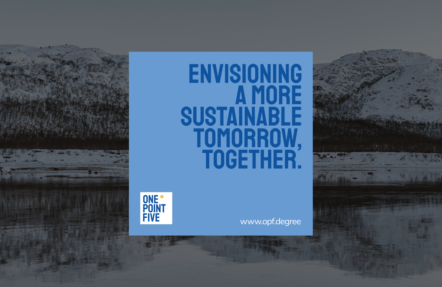
OnePointFive is a sustainability management consulting and technology startup aiming
to partner with businesses, provide consulting services, and help embed sustainability into
business practices. “OnePointFive” is a play-on-words of “1.5 degrees Celsius” – which is
the temperature limit for the warming of the earth to avoid severe impacts of climate change.
The brand’s mission is to make complex information clear and transparent for decision-makers.
I partnered with their CEO to create and launch One Point Five brand.
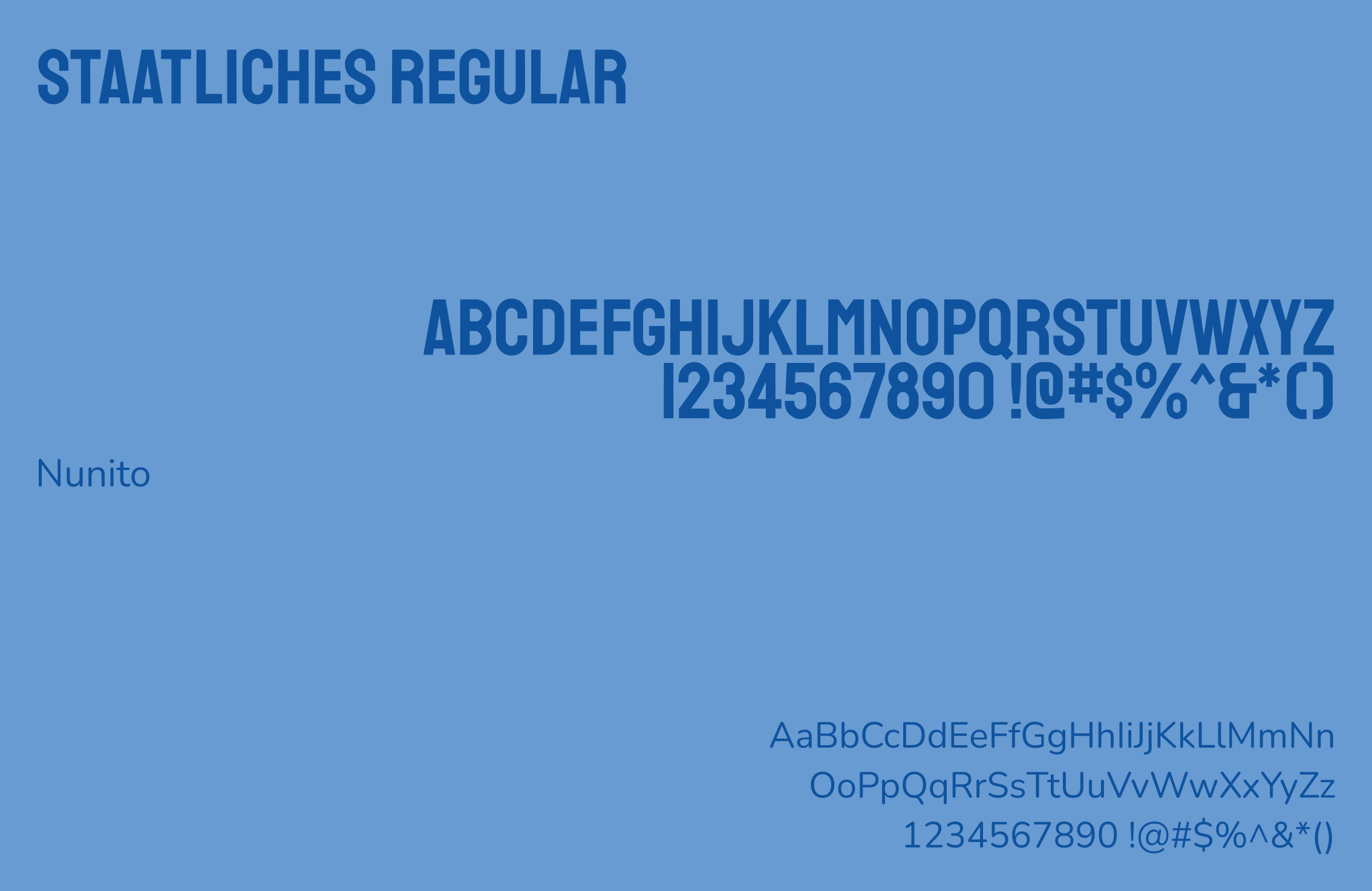
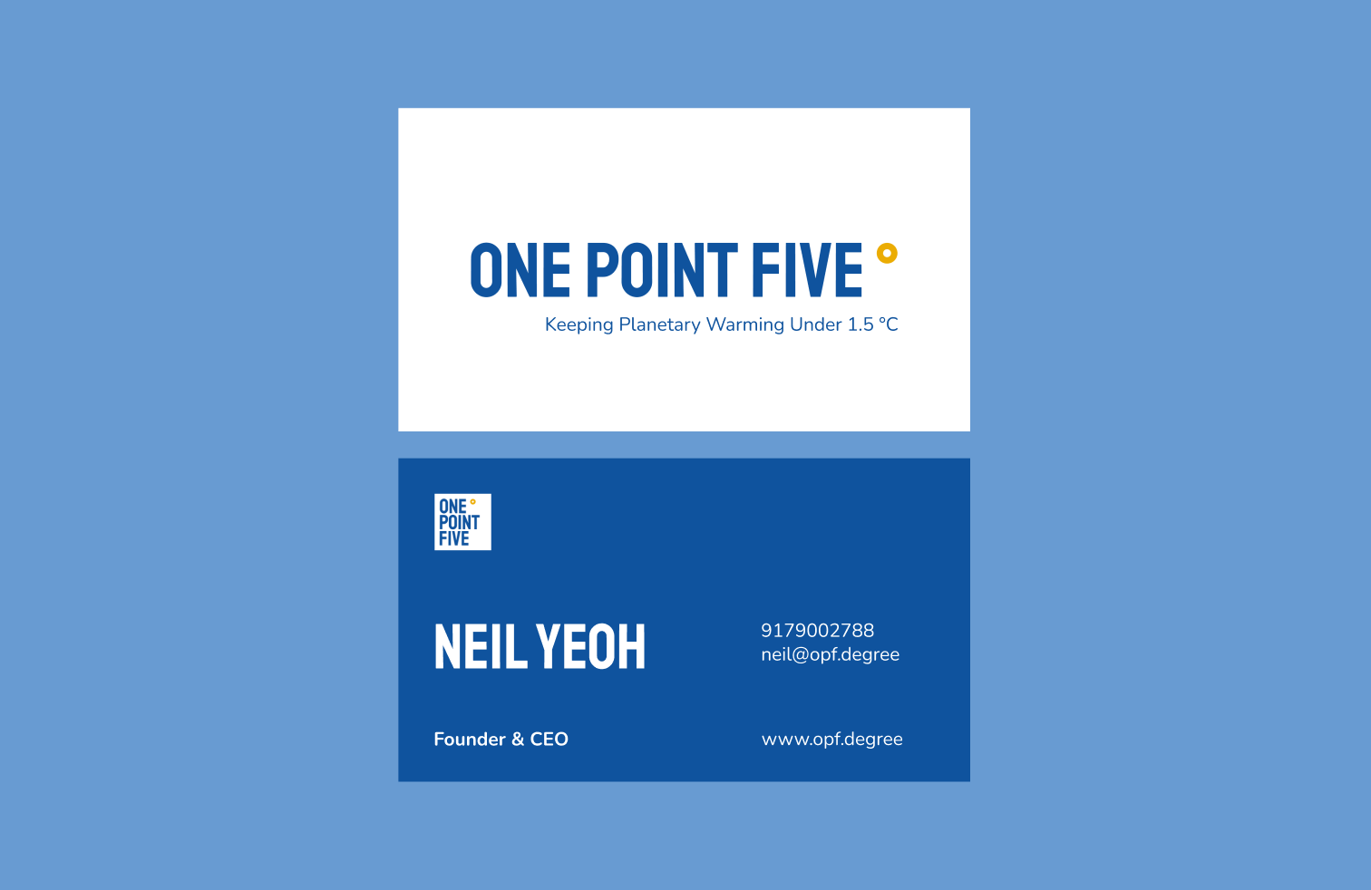
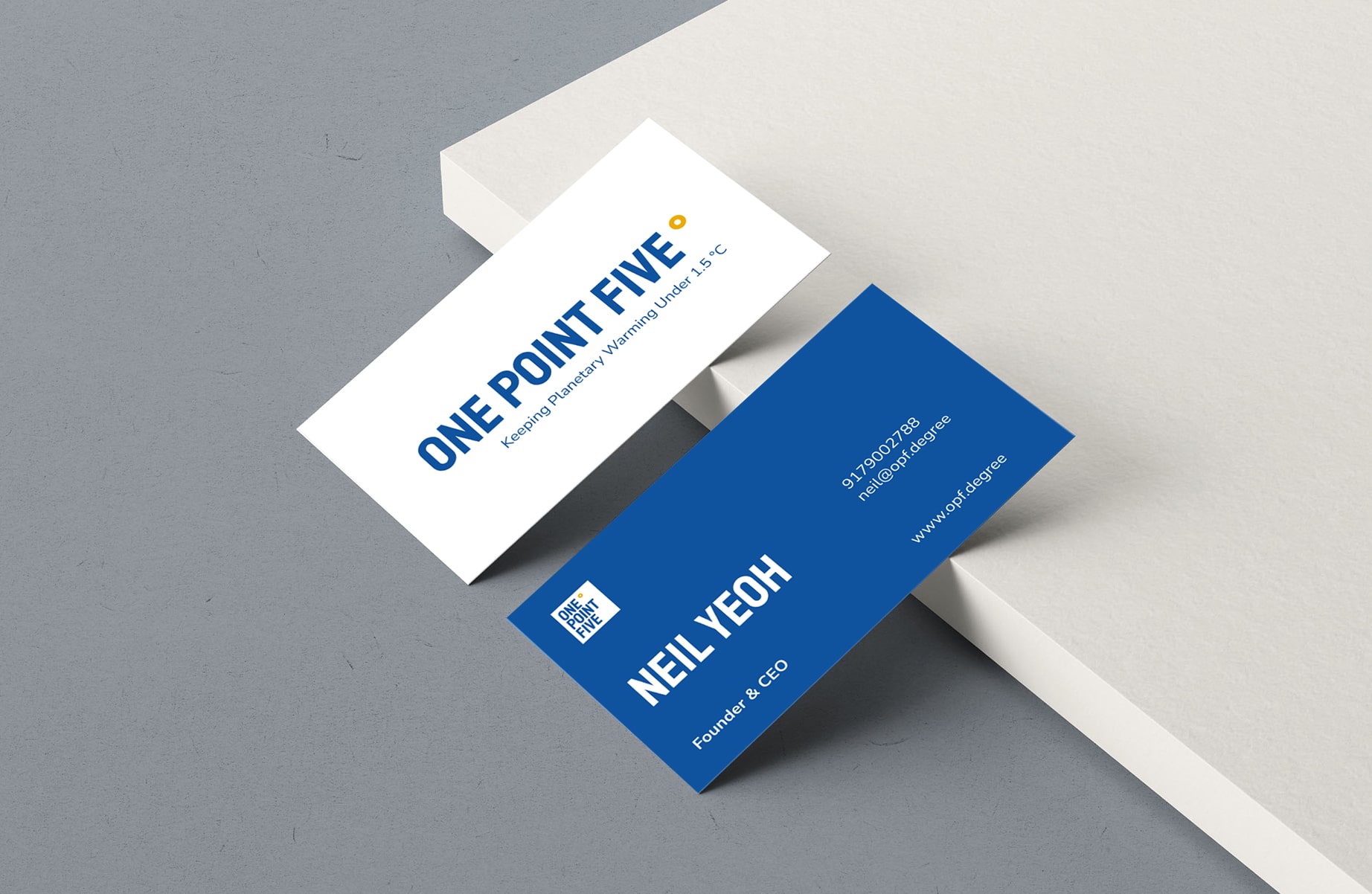
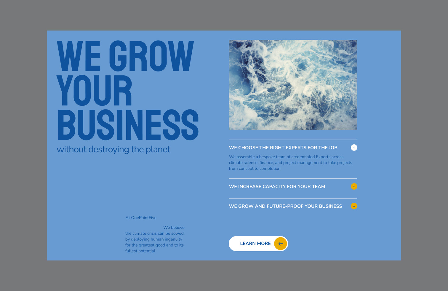
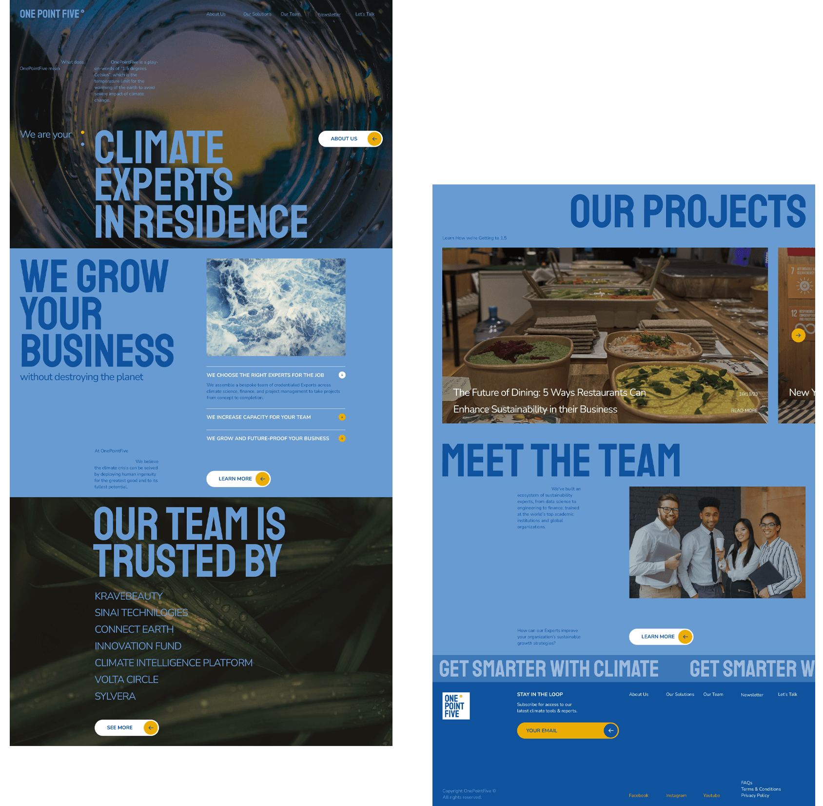
I designed OPF’s visual language through a blend of sturdy typography, a humble color theme,
and a solid layout style, which indicates the company’s ability to provide simple but solid solutions.
The color theme of primarily blue and a hint of yellow captures the company’s humble but
confident personality.
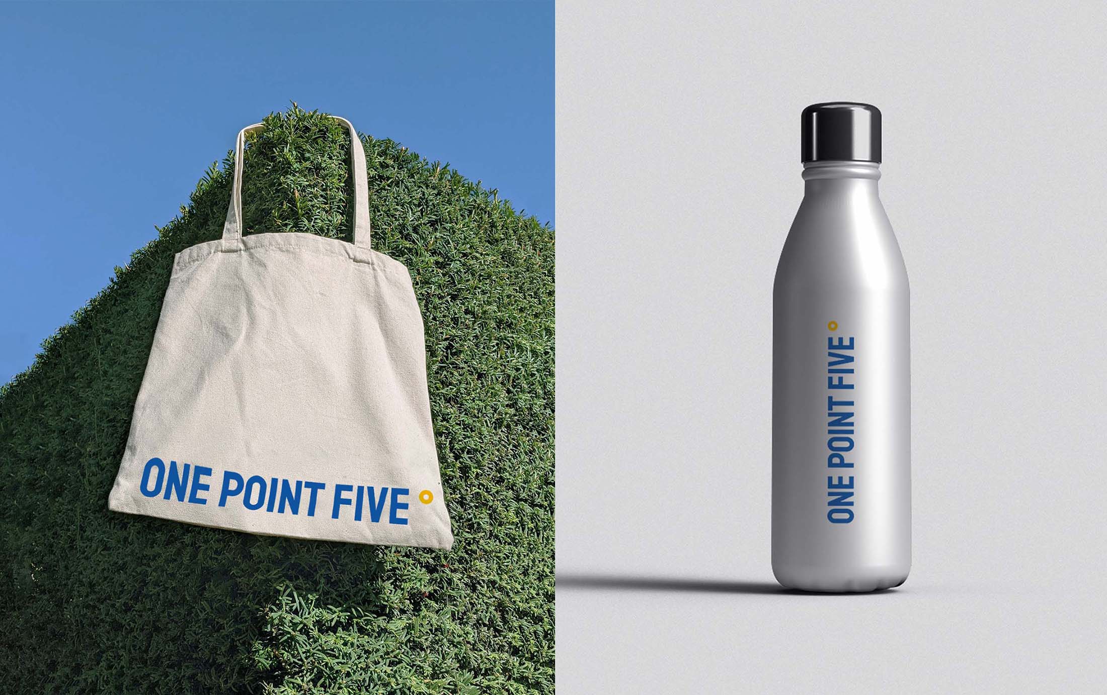
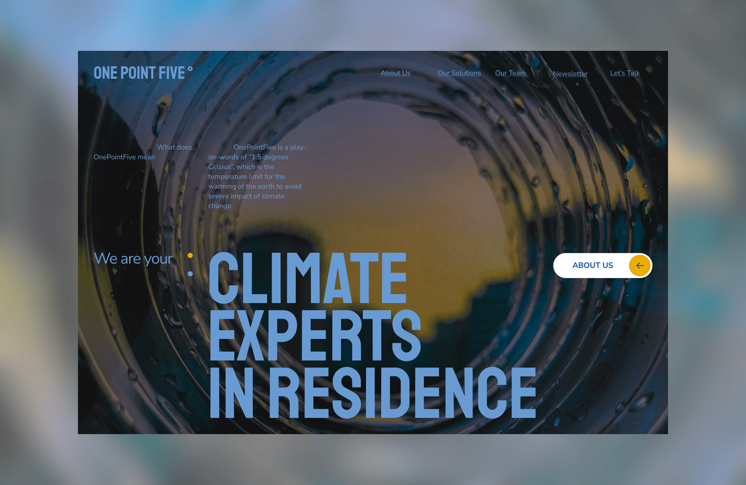
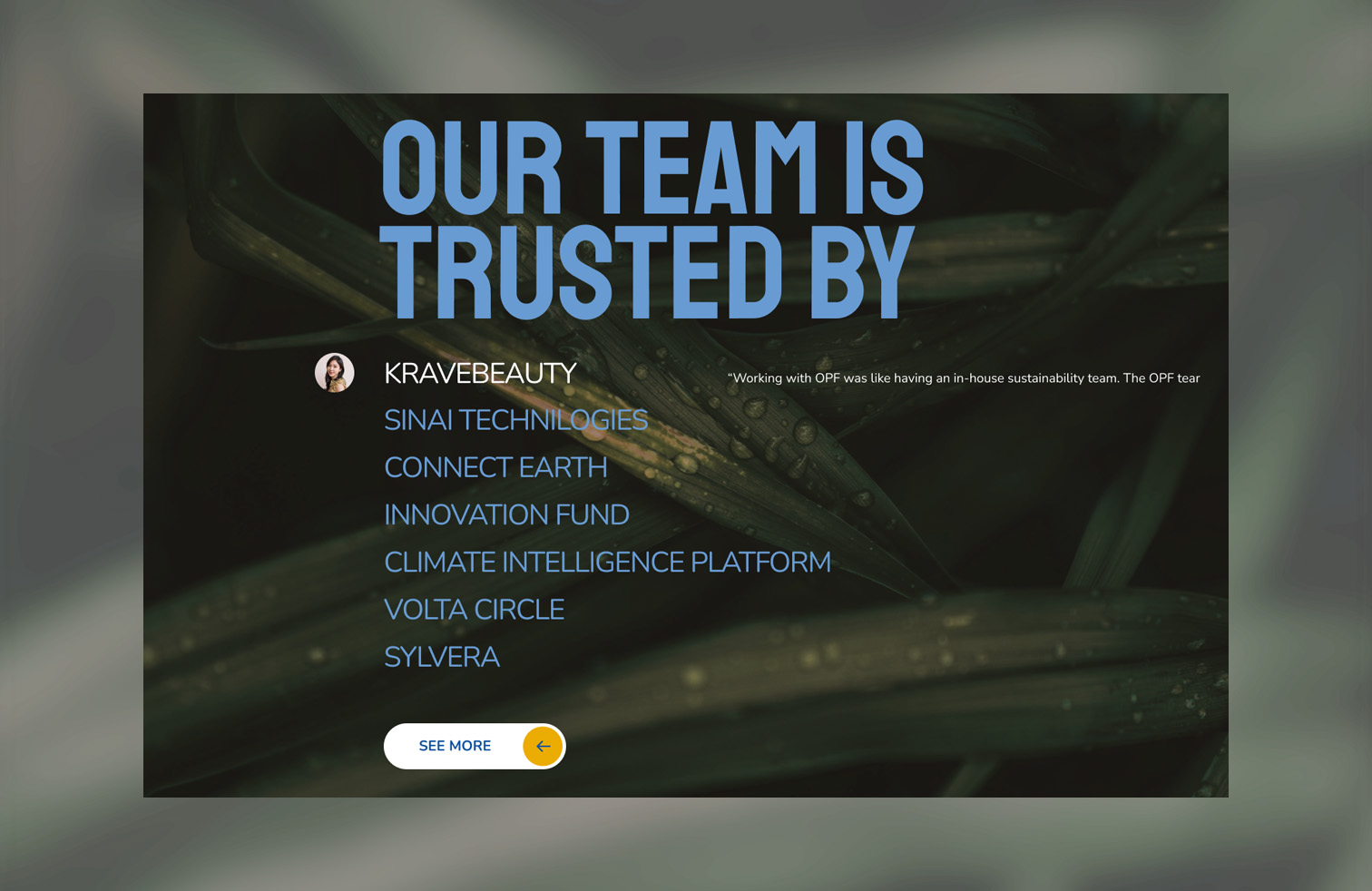
The photography leverages the brand’s color theme to resonate with the brand identity. This helps
the brand maintain a consistent approach while conveying its focus on the environment.
I animated the logos so that they transform from the primary to the secondary to symbolize
OPF’s ability to transform business practices with its solid services.
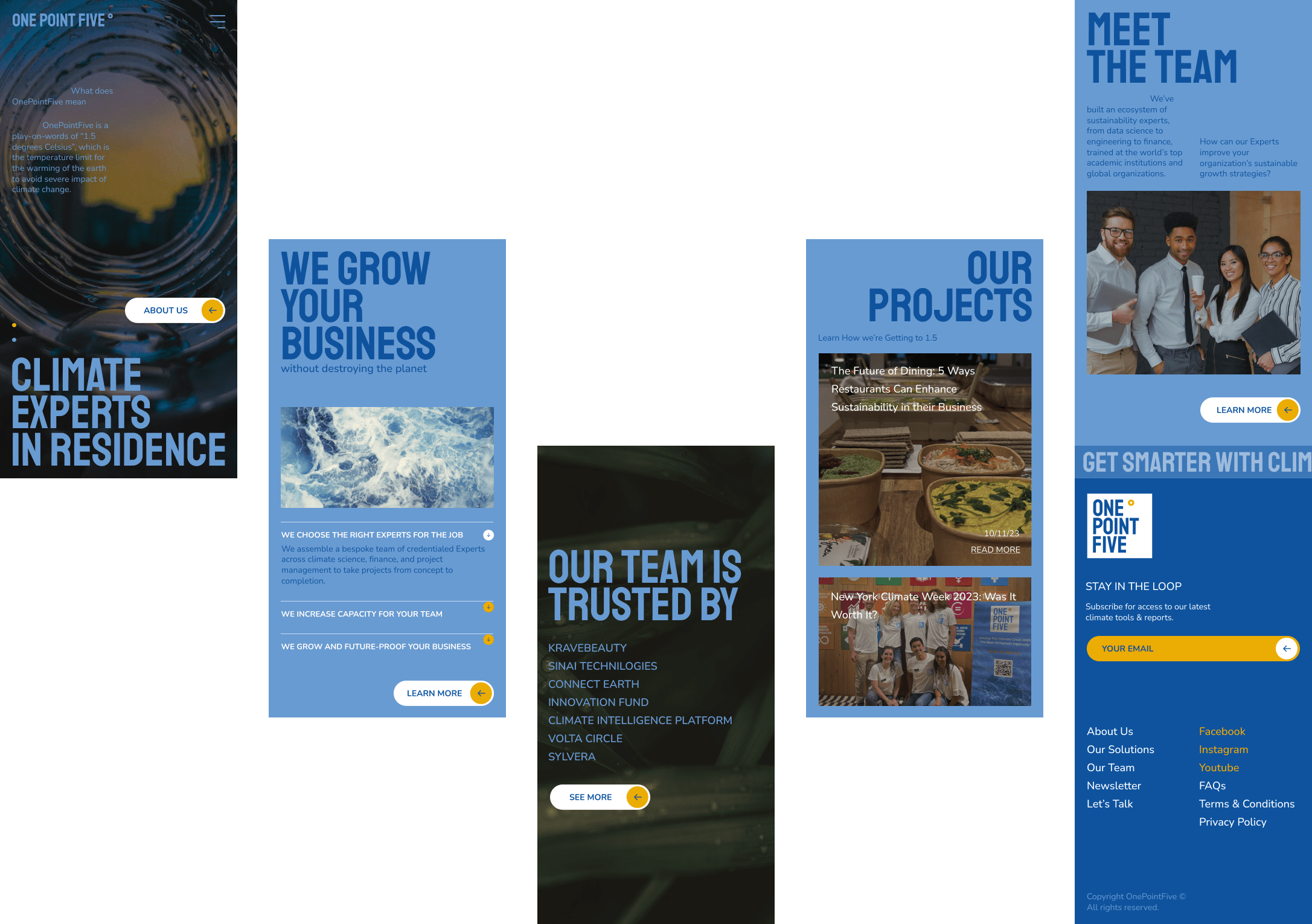
A cohesive visual language was developed for business cards, marketing materials, and icons,
under a simple but solid grid system.
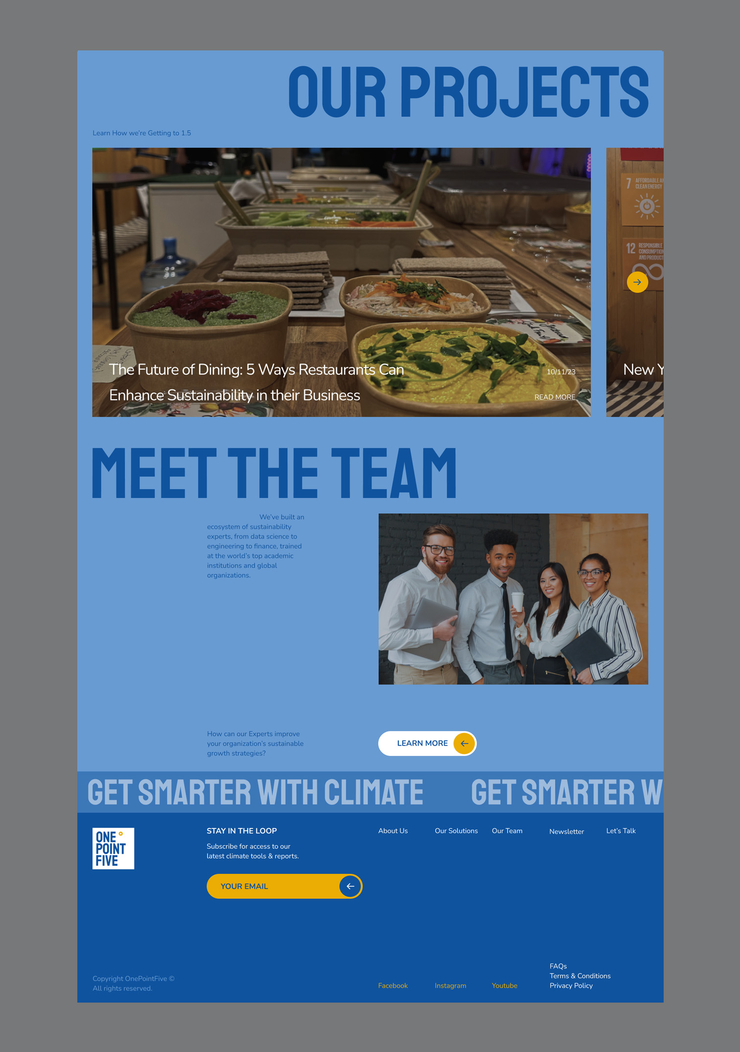
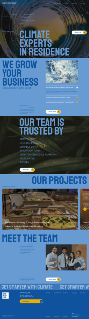
The OPF website greets users with a blend of solid typography, atmospheric photos, an immersive
layout, and subtle animation. The main goal was to make the site more structured and create
the necessary accents to create a memorable website.
* I redesigned the website homepage as a design practice. All content belongs to its owners and
is used for training tasks.